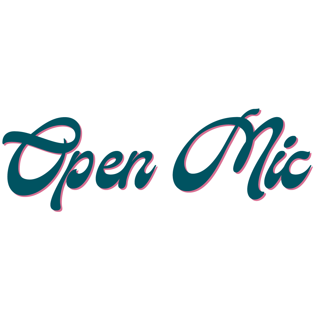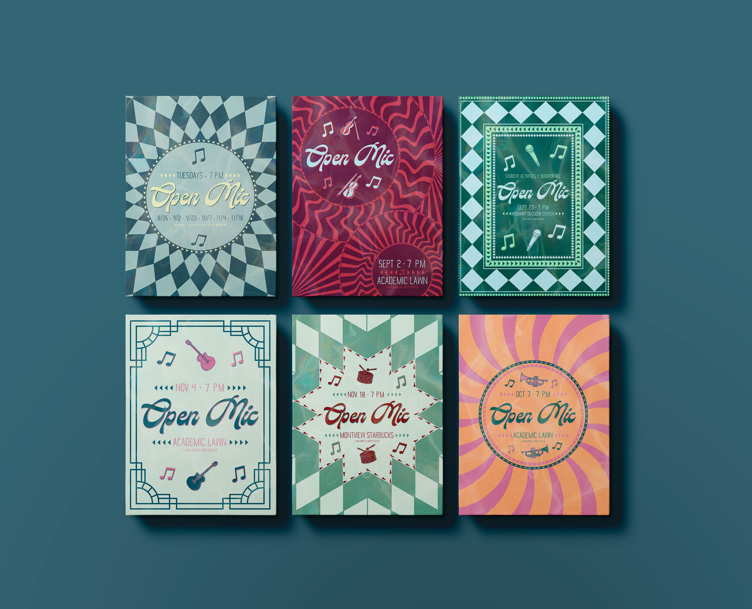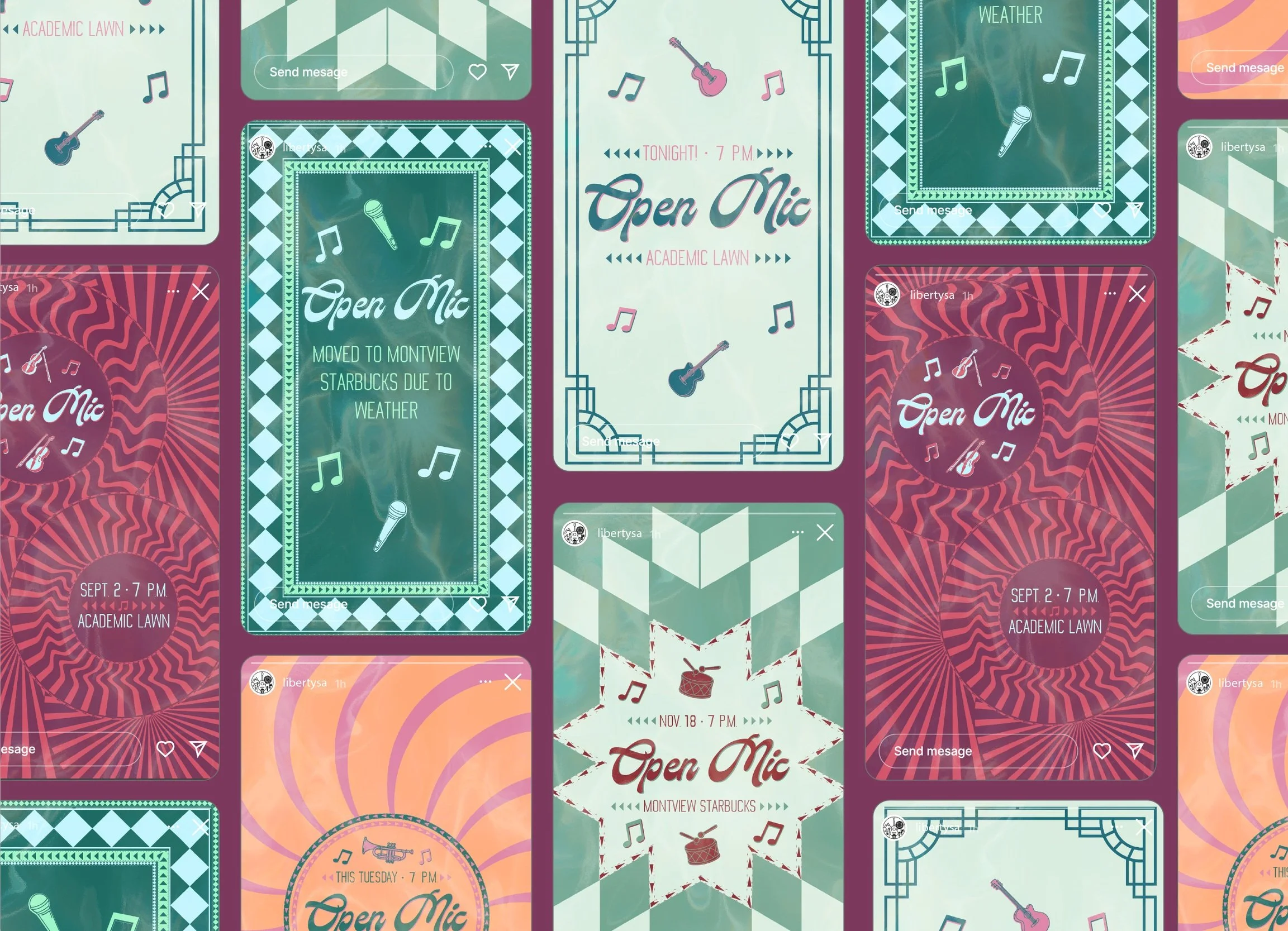

For the Fall 2025 Open Mic series, I wanted to challenge the expectation of what recurring event branding typically looks like. Rather than repeating the same graphic each month with small adjustments, I intentionally designed a completely unique visual for every event in the series.
The challenge then became creating individuality without losing cohesion. Inspired by retro patterns, bright colour palettes, and playful illustration styles, I built a system that allowed each piece to feel fresh while still clearly belonging to the same campaign family. Every design was limited to a three-colour palette, with one colour intentionally carried into the following month’s graphic to create visual continuity throughout the series.
I also alternated between radial and rectangular compositions to introduce rhythm and variation without repetition. Seasonal cues influenced each design as well, allowing every event to reflect the atmosphere and timing of that specific night while still contributing to the larger identity system.
The series expanded across both digital and physical touchpoints, including web graphics, advertisements, and social media assets. More than anything, this project became an exploration of how consistency in branding does not always require sameness, sometimes cohesion is built through intentional evolution instead.